Thursday 29 September 2011

Peer review crit 4 - Gifting, animation

Sean (Kibeom) Park:

One thing that i found very intrestin and liked about seans design was the fact that he used no doors. This created more unique areas and transition spaces. The animation and the A1 piece of paper blew me away because of the quality and amount of work done. It demonstrated that he had done alot thinking and reserch, concepts and development. One thing that i noticed about his work which was very different that most others was the fact that his was very structured, formal, clean and precise where as everyone else was a bit sort of like artistically expresive with things like colour and medium - paint ect which is maby is something he could have tried which may have improved the end result and design but overal i like what he done as i think it worked out very well for him.

http://www.youtube.com/watch?v=NXEhjq0KIKE&feature=player_embedded

Halen (Haorong) Chen:

Halens word was Kirkostructa which means a "building in a cylindrical form. It differs from most contemporary structures of that shape - arenas and stadiums, often at a large scale, roofless. This type of building will be smaller and much more versatile". She has used this word to influence her design. 
her animation was easy to understand which helped me grasp the concept of her design. she encorprated elements such as a rooftop garden as one of the clients was a landscaper. I like that she has taken into consideration her clients and who will be inhabiting the building and how she meet these peoples needs, wants and intrests. The design also provides vast 360 views which creats a openess and unconfined feel to her design.

http://www.dailymotion.com/video/xld9of_architecture-gifting_creation

 Lauren Collins:

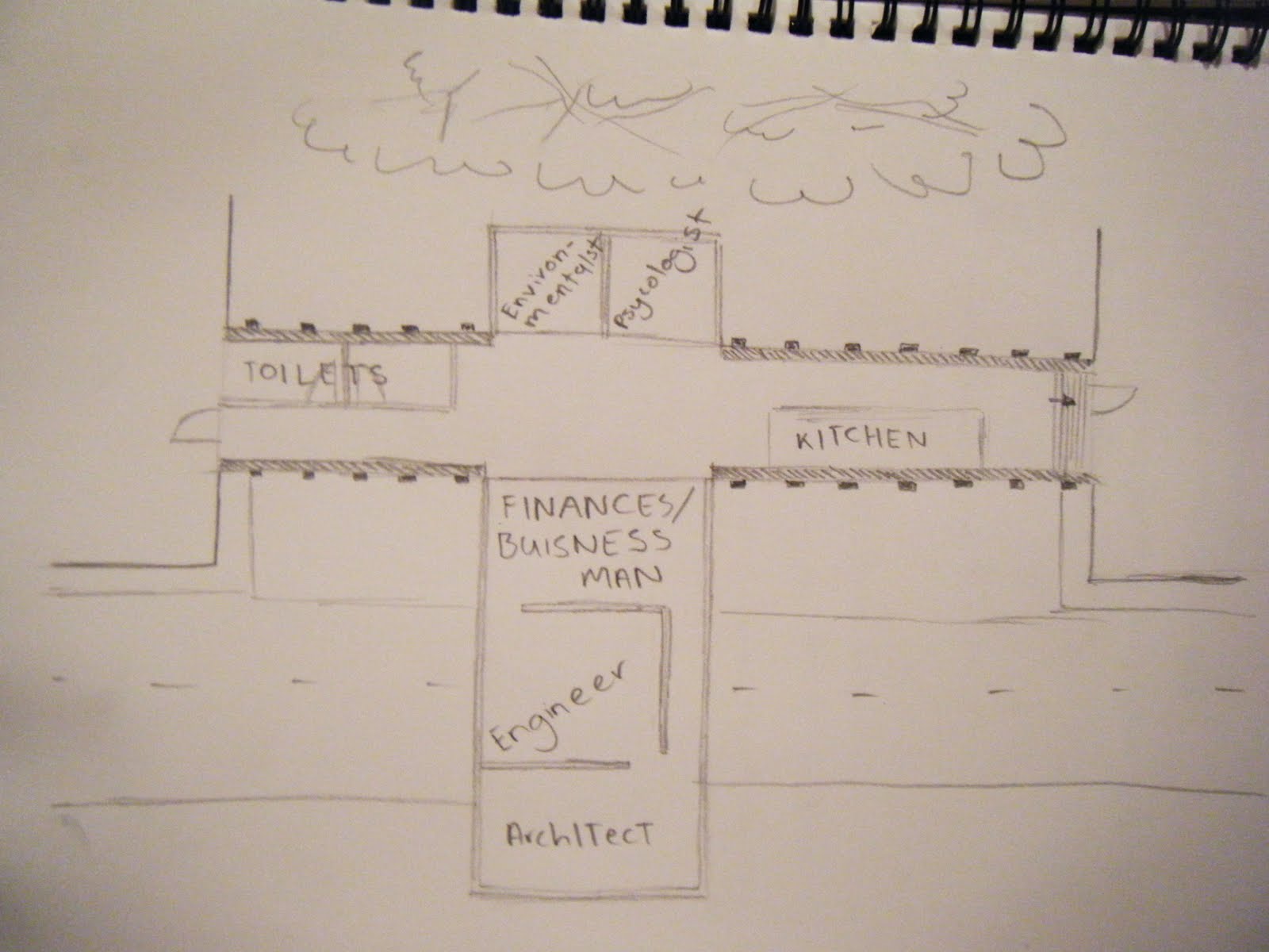
 i like the fact that lauren got real messing with the paper. It helped me to understand and to link to the previos project which she was incorperating into this design. I think it was really good how she was interacting with the animation like how it showed her dragging elements on the page together to form her design. A down side to her animation was that it had a long period of nothingness at the end till the music ended which is understandable cause some of the software is hard to use especially when you dont have long to learn how to use it. its good she considered light, flow, site. The page consisted mainly of a floor plans, it would have helped me to understand and visualise the design better if there were some more 3-D, elevation and section drawings of the design casue i found it kinda hard to see how the  quite squiglyish wall design would look as a structure/from the side/in 3D

http://www.youtube.com/watch?v=BO7MFUGWOPM

Wednesday 28 September 2011

 This is my model on the  site. The sitemodel thing is pritty sad looking but thats all i could get donein the time ihad. i dont really want to present this but it helps to give peole a basic/ better understanding of my designin relation to other stuff. i made a few trees to put on it so hopefully that will make it look slightly better andgive abitmoresenseofheight. i had to paper mache of the contour model i made cause i couldnt make a new one and this one i had was really messy and dirty from makingmy model on it and so paper machewas the quickest easiest way icouldcover it up and i didnt have any other materials to use or that i could get in the middle of the night. Since i gottold tomake the site model huge to include the road and church,i madeanadditional sitemodel piece and paper machedthat too so it would match the other one. it didnt look to bad until it dried and the pencil onit probly wasnt the best option but its plain andsimple so people can focus on the tram stop model. It hasnt been the best week due to this last minuet rush to getheaps of work done but i liked the laser cutting. The people on upper queen street are really good and nice and this has probly been one of the most helpful workshops.
My model tookway longerto make than i expected so ive kind of runshort on time to make a goodsite model and completed matrix. I had a few issues with makingthe model. I forgot to consider how much wider the papermache and laser cut pieces would make it and so some of the passage ways seem very narrow which wasnt helped by the model kind of warping with wet paper mache. It was hard to keep it in the right position so it would dry out right but i managed to get all the holes in the model fairly alighned. You can look through them and actually see through out the other end.


Monday 26 September 2011

final laser cutted pieces

today i got my laser cutting done. All these things in the bag are all the little rectangle pieces that i got laser cut for bricks
My hands got insanly dirty from handling and pulling apart all these little laser cut pieces. some of the pieces were stuck to tape to them out of the machine. When i pulled them off this tape, they left a pattern on the tape from all the black burnt stuff. This could have been an intresting way of using the laser cutter, using it to create brick prints but i already have my material idea which i will stick to

making a mock up

In the weekend i made a site model since my design is going to work/fit with the contour/ground 

Below is a concept model of my deign applied to the site model.


The tutors liked it and my material. Now i just have to consider the withs a bit more carefully and how im going to have this structure sorta suspended cause the wood skewers in the phots arnt actualy part of the design but are just there for support but i dont want them there. I also have to look at how people can access the top bits

Sunday 25 September 2011

Testing the laser cutter

On friday i went to the laser cutting place to get my idea and material tested. The two ways i was thinking about creating bricks was by engraving a bricck pattern or cutting out rectangles and apllying them to anouther surface. The engraving didnt turn out that well. Its not that easy to see since the material contains black in it. However the seperate rectanges stuck to paper mache turned out quite well. It will be harder, more fidley and take long to make my model using this way but it should be woth it i hope. This material is quick, easy and cheap to laser cut but it smells really bad and the man there said it creates alot of black smoke, which isnt good,due to some adhesive or something in the material.  

Thursday 22 September 2011

Starting laser cutting workshop

Our 12tram stopsare

1. St. Andrew's First Presbyterian Church
2. The Old Railway Station
3. The Old Railway hotel
4. St Paul's Church
5. School of Architecture and Planning
6. Town Hall
7. The Civic Theatre
8. Ferry Building
9. The Clock Tower
10. Smith & Cougheys
11. Auckland High Court
12. Sky  tower


View from my site - st andrews church


View of site


We have been asked to design a tram route and tram stop which is our gift to the city. My group chose to have a theme of architectural history for international architecture students. So we plotted tram stops by buildings such as st andrews church and the old railway station. I have chosen to design the tram stop for st andrews church. I chose not to place the tram stop right infront of the church but on the opposite side of the road so it is in the triangle boundy but also so my design will not take away and in a way wreck this historical building and it will also give people a view of the architecture from a distance. Since our theme was for architecture students, i was think i wanted to design my tram stop so that it controls peoples view and frames the church in a way which people would usualy not look at the build, giving them an unusal and different experience and perspective of architecture. This could possibly work out to allow people to see parts of the building that might usually been taken for granted/ not really noticed ect. Anouther thing we had to do was incorperate a material from our 1:1 detail fromlast week and how weathering would effect our design or material. My 1:1 was made out of concrete, brick, and metal so i went looking for intresting materials that could represent these materials or weathered forms of theese materials and would be intresting to lasercut. i found/ thought about things like paper mache, cork, rubber cork. The image below is made out of cork and what lead me to thinking about cork. This piece of work is amazing and i know i couldnt do anything near that good but it represents brick, and stone very well and looks weathered too.

im thinking maby i should use brick cause i could create wall type things and pull some bricks out which would be a way of controlling and creating a unique way of viewing st andrews. the design will be hollow underneeath so removing bricks will create the lighting efect. the underneath creates a shelted enclosed environment while the top is open and free.  it will give people the best of both worlds. Weathering doesnt have to be restricted to the material so in a way the weathering i am dealing with could be light


i didnt know if rubber cork could be laser cut but i tested it today and it looks really good. The only problem with the engraving of this material is that the engraving doesnt really stanout because of the black coulor in the materual. I gut a grid because i wanted it to represent brick but im thinking maby cutting the rectangles and applying them to anouther surface might create a beter affect but that is something i will have to experience with

i have to think about how my design is going to work with the site. the site is slopes and is on the edege of the park. the tutors gave m some helpful ideas today that really is going to help me develop this idea into somthing much better. My design might go futher along the sigh to instead of people walking up the foot path they can walk over my design and see the church in a different way as they differently approach it

This is a basic quick sketch/development of my idea. I started of thinking about walls then pulling shapes out of them to frame a paticular view. I decided brick wall then remove certain bricks to create the view. the whta if these walls became apssage way/area things that pepole could walk up on - open, or beneath - for shelter. Putting the design on site which is hilly and peole maby walkingup over my designinstead of footpath to experienceandview church in adifferent way. Easy to step onto at bottom - close to ground,has ramps so you can go over it. The widthds vary. large wide area for groups to wait for tram or narrower areas for one person toexperince design andchruch andwaitfor tram. pullinng bricks out willcreate a lighting effect for the underneath areas

Monday 19 September 2011

Gifting

Jusy asked up to find something about gifting. I found a book called The Gift: how the creatie spirit transforms the world. "Reminds us of our cultural gifts and our responsibilities to them" 
this book is about how gifting has shaped society and human consciousness and is linked to the creative process.THis book is about what humans take from the world and transform through work as it is about how the work transforms the world in turn. This book draws on ideas and examples such as Traditional exchange ceremonies. This book itself is gifting. It gifts inspiration, companionship, and understanding to its readers

this website describes a little bit more about the book:
http://www.independent.co.uk/arts-entertainment/books/reviews/the-gift-by-lewis-hyde-424028.html

Wednesday 14 September 2011

Peer review crit 3 - gathering, laser cutting

Jack Tiong

I was looking at jacks blog and he has alot on there. He has done alot of thinking,reseach and development which is why i think he has turned out with a good design,concept and model. His design is about photography so he has used the idea of controlling  different levels of light through out the building which he achiteve through the use of a light tube thing that reaches from the bottom to the top of the design. to help acchieve this he has given each floor a different orientation in order to create the effect he wants due to the different positions of the sun during the day. I like that he done this as hes focusing on creating a experience form people which form develops out of instead of him just worrying about having a intresting form for his design. he has used gaps/windows in the lightwell which decrease in quantity the closer it gets to the ground to create the decrease in light. this actually created quite a cool, intresting looking element.


Joyce Kwong
joyce wanted to create a area where pepole can play and experience fooball. She  wrapped the layout of a football pitch around an object the extruded and pushed back elements to create this wierd shape building whcih i thin is a pritty intresting way of obtaining a form. i like how she has minipulated light in her design. it creates different patterns and effects and experiences for people through out the day as the sun crosses the sky. I dont like the fact that the whole model is made out of only mdf. It would probly look better aswell as give people a better understanding of the design if anouther material or a combination of materials were used. However i understand that there are only certain materials which can be laser cut. the overall model had been put together well and was of a good quality.


Han Kyu Lee
Hans design is quite simple, long, slender, narrow and tall.  this is quite refresehing to see as most people have followed quite a sorta opposite form and idea whilst this one appears quite fragile and elegant from a distance. I didnt quite understand the concept behind this design and the glue used to put it to gether was kinda messy which made the model not so good up close. However like how the floors of each level are not flat. Some are slanted, have dips and even curved. I also like that he went beyond using the laser cutter solely for cutting. He has used it for engraving and the burn marks to provide colour to the design.

Final 1:1 model

final model. I was playing with possibilities of materials so made a metal frame and  a concrete frame for the grid appearance on the out side of the concrte wall.


Tuesday 13 September 2011

people kindof convergere and are condensed in to a smaller narrow area(concrete hallway) then gat to this part where theres a suspended glass box penetrating this and the atmosphere completely change and people become more free, widespread in a larger area that seems to not be confined


here i was gust thinking about how this space could be possibly laid out if it were an office. An architect might be on the end of the glass box area that projects out for inspiration of the sourrounding built environment. An engineer might be next to the architect as these two professions work very closely together andwill be interacting alot. A finance man could possibly be in the middle of the area as everyone in the office needs someone to look after finacnces so he easily accesable. A environmentalist could be in the back by the trees for observation. A environmetnalist would be good to have in the office for the architect and engineer to consult about their designs and how they would affect the environment. A physciritrist might be that fith person as everyone else has very stressful jobs and having someone to talk to could really reduce stress and increase their work effort/production.
The glass rectangular form Has framing around its edges to give it stregth and structure so it doesnt break/fall. the right side of my design goes up on an angle so to connects to one of the floors of that building. the buildings on both sides of my  design do not have the same level hights which is why i had to change one end. there is also a pole and attatchment to lighpost for suppot as i wasnt sure if a suspended box would actually hold up by itself in real life and i dont think it would for this size. My president studykind of focuses on and frames nature. hes did this through using mainly glass with metal framing. I thought about this. A reason for the glass box penetrating the contrasting concrete form is that it in a way creates a frame for the trees in the back ground in stead of blocking out and ignoring nature like many other buildings do
final augmented drawing

Crit - Waking up, Second life

I will write thses up soon
Ivrel Kagaoan:


Ivrel draws on the idea of showering as part of the process of waking up. to him having a shower fully wakes him up both physically, mentally and psychologically. He shows this idea in his design by creating a fountain thing. most of his design was created in 3d max which looks hard to use but it allowed his design to be something quite different to what it would have been on just sl. Im not so sure about making water dropplets tho. i think it is a very literal way of making a reference to water and maby there could ave been anouther way to do this and concrete looking forms cannot float in air.  I like that he has thought not only about visual elements of his design but has thought about sound, water flow, the way the waer pours and how this effects the experience as opposed to  just using only literal refernces. the spirting and slpashing sound of the water resembles a shower, the different level circles alow water to filter and flow downward just like it would in a shower. it sutblely makes refrences to a shower which can evoke the feeling of waking. He has create a peaceful calm area where peole can freely think and relax. The rings basically are a narritive of showering process. the smallest represents the start of the process where are minds still arnt quite with it which is portrayed by lack of water movement. as the process continues we get more concious and so the rings get bigger and have move activity/water movement. 


Ji Lee
Ji used to have a fear of going in the water but when she actually went in the water she had a "wake up" and realized that it actually wasn't as bad as she thought and this gave her a perspective of looking at the same place without fear. she used a street art/ graffiti on a box which light up at the words "wake up"to link back to her 1:500 and 1:100 and to link to her memory by "representing the change in the state of mind and how the same scene looks different according to the person’s preconceived thoughts." i like the ideas behind this design. She has thought about waking up in a different way where most people just looked at it like someone literally waking up in the morning. This gives her project a bitmore uniqueness. I also would like to say that i was impressed how she managed to make the whole design completely change and i liked that she made and used her own textures which look better and are more original that sticking only to second life ones. It must have taken alot of hard work to get it right.


Emily
emilies design is about the idea of a crack or gap as she though that the old railwaystation, her site, doesnt fit in with its sourroundings as it was building in anouther era as it is now souronded by modern high rises and structures. she uses this gap/ crack idea to make a refernece to the trasition between two different worlds - the one where we are asleep and the one when we are awake. i dont quite remember what the reasons for the funny shapes are but they would  create a different atmosphere at different parts of the day say light or dark. However i would find it hard to navigate though this space as they are everywhere and would get in the way. I like the colour and texture of them tho. they look quite pritty and elegant which heavily contrasts to the dark walls on either side. this may possibly be anouther refresence between two different worlds


Crit - Sustinance, Augmented reality

Hea Choon Pak:
Hea's idea about sustinance was music. Nature and the environment is full of sounds which he has taken to be music. I really like this idea because if people stop anywhere and take the time to listen, its quite easy to make a beat out of sourounding sounds which people usualy take for granted. The siteing of the design is in a fairly quiet area that contains water. HIs design is based on piano keys, some of which are pushed down as if someone is playing them. This is an intresting idea which hes used to create levels for which can be used for different thinks like seating or dipping you feet in the water. His design captured sound through peoples interaction with the water which i think is very effective as he has designed something where people can experience the design and not just inhabit it. His final model was very well executed, conveyed his idea well and he gave us some ver handy tips about building and concrete casting.


Jimin Jun:
Jimin was focusing on reading  as sustinance as it is a majour part of her life. When she first said reading i though it was a strange take on sustinance but as i thought about it, it is a majour part of everyones lifes.     Its esential for people to be able to read so they can get a job and make a living in this world. Its also a good passtime and an essential means of communication. As jimin enjoys reading, she focused on this aspect and designed a space for other people to experience this too. The form of the design was inspired by branchinchin trees. The design doubled as a bookshelf and seating for readers. I though it was really good that she made different seat types to suit different people and be more erganomic and asthetically pleasing than a bench. I didnt really like the 1:1 model, it didnt capture the real material and material weight of the design  and i didnt really get her idea straight from looking at it. however i understand that we are not actual builders and doing something of this nature and working with real building materials at this scale would be quite difficult compared to what sort of models we have previous been required to make.


Joanna Bolland:
I dont remember much about this project as i missed the start of the crit and cant find my note. There is nothing on her blog to allow to re crit bymyself but from what i remember the form was cylinrical made from different hight pieces of wood. Anouther thing that i remember is her 1:1 detail where she manage to screw bolts into concrete which must have been pritty hard and it impressed be that she went to such a length to get the detail accurate to what it would be in real life

Monday 12 September 2011


i used these to stick the mateal frame together


a layer of concrete, metal rods then there will be anoutha layer of concretet on top