Wednesday 24 August 2011

One augmented drawing of mings waking up project, one of nates sustinance project and then one on a chosen site where we design a gathering place incorprating ideas from ming an...d nates design. Each drawing we apply a idea of material, structure or philisophical to it from our president study. mings waking up one was about blocking out noise and light i think and nates sustinance was like chaotic vs calm, stress self help ect.
Mings design mixed with president study structure


Nates design mixed with presidents study material
 a place of gathering and combines ideas from mings design, nates design and my president study. It uses the contrasting of emotions like nates. this is done by having a completely enclosed conrete hallway space area where you feel very safe and enclose but then you get to this glass box area when you feel very unsabe, unsafe. I incorperated the formal box/gridlikeness of mings design into the form of my. My president study influenced this design by the grid and the material choice of concrte, glass and maby metal

Wednesday 17 August 2011

this is the sculpted prim i made. Its much more efficient for pushing up the rectangular prim and it looks much more intresting. I put a script on them to make them move up and down to shake the interior area, which is set to physical so it falls and is affected by gravity.
I made my own metal grate sort of material on photoshop since the one in sl has already been used so many times by other students. Since this material felt very cage lik, i added anouther aspect to it which is wood - 2nd picture

All the images below are of my final design. The interior twisted rectangular form falls and gets pushed back up by sculpty post prims i made. This reapeats and creates movement and vibration to the prim. This links to sustinance as people need to be healthy and like to have a good figure so the prim becomes like one of those vibrating machines that people stand on to burn and demolish calories. The rectangular bars are for people to hold onto during the process. The jostling of the area also creates excitement and adreniline which is also something we need to sustain ourselves.


At first i thought the white texture i chose was old weathered wood but after talking to the tutors and hearing what they thought, the material caoul actually be concrete like the collumns in our sudio. I think this would be much more appropriate and gives more weight to the design. I wanted to have quite a bit of contrast in the final design to show that demolision changes something to the complete opposite. Some ways i have done this is the choice of textures and the thickness of the main elements. This links to sustinance because we need demolision to sustain us like food going into our bodies in their real form and coming out in a complete differen way or like excersice where we can change our own size and appearance.

Tuesday 16 August 2011

i added a piece of glass to the roof to create the effect that i was talking about when i chose the site in a earlier post


I twisted the metal grate area to show the deformity and change that demolition creates


Sunday 14 August 2011

During my desktop crit with judy, she talked about some of the problems that i highlighted in the previous post. She wasnt quite sure about my design and it made it harder for her to understand the concept since i didnt site it to begin with. However she liked the idea of demoliotion as my take on sustance.
Since then, i have found a site for my design:
Site in real world. Between the two tall buildings on the roof on the 2 storey yellow building
I chose this site as my design will be surrounded by tall buildings which creates an ueasy unsafe feel especially if you think about how they sway more and feel like they could fall down on you. This creates an atmosphere that i think demolition would evoke.


Site in Second Life - on the black area next to grey wall

On site looking up

I chose this site in SL because it has similar elements and feel of the real site eg the tall structures on either side

Saturday 13 August 2011


I started playing with ideas on second life. The images above are just a quick initial concept. When the avatar speaks, the random forms change into something/basic building that would be suitable for human use. Therefore the idea of desconstruction of objects and naturalness into things that people use and need for living - sustinance. Some problems with my design so far are: I think i need look at otherways i could fit the idea of deconstruction into a design with out makeing to actually deconstruct into different forms. I also have to think about how and where im going to site my design.

Tuesday 9 August 2011

Notes and ideas from discussing the readings:
Eventimental - sounds like environment but inclueds eventtopography - about the landscape.
subject -  not a personal, the topic, or maby people that come in and interact with the architecture  subjective - what you think object-things that there
function and capactiy - like the different functions of a object like a concrete rectangle can be a bed bench seat
hegement
hermanutics - got to do with layering, seeing defferent meanings out of a paticular setting ect. To think of to make up of. You translate your idea into architecture.
this article talks about laytency potential - you may have an i dea/view of it but can never predictct 100 percent how it turns out whether than means how people use it ect

you should test an idea to prove it works or test it until it doesnt then fix it

Mosaic  heterogenacy - how do you design if you dont know what  or who to design for. Litlle things come into relationships

soft space - trying to talk about it in terms of space. Understanding verticeies.
ecoscape -landscape and environment but have a headspace about ecology.
what is deif between object instilation and architecture architecture is different to instilation, it is

Last weeks group, architecture is:
>supports human living
> deals with whats there and not there
>work of collective
>is a process
>has spacial quality
>improves quality of life
>used evry day (everyday event)
>elements of environment (EE)
>subtle variation

Group 3, architecture is:
>alive - has charector and changes
>personal - we all intersct diferently
>about change - evolution
>stimulus - has an element of visual manipulation. Effects our senses.
>architects need to be aware of their own intentionallity. archtiectre is human intivention
>is relational - a whole
>

My ideas about our theme Sustinacnece:
maitinacne. in out. things have to change to keep us the same. Distruction - acts of distruction. 4-5 ideas. fire. Stomach churning, chewing. Changing of form, colour, smell. oxygen to co2. death, circle of life - body to grass give us space, killing animals - food. forests to plantations
desktop crit - what is wrong, problem, mess, mistake with our project

reactive architecure

Wednesday 3 August 2011

Im not so happy with my final. My a1 sheet should look way better, my animation isnt very good quality, and my design/ presentation is kind of confusing which i kind of works with my concept of confusion. I should have and could have done much better but i guess i shouldnt leave work to the last minuet and then rush it all. I had trouble with drawing some angles and certain pieces of my design. My idea about waking up is kinda confusion. When people wake up they are kind of dazed and not with it. I incorperated this into my design using triangles placed at different angles, the floor being smaller than the roof, and a kinda illsion triangle pattern as a skylight thing so when the sun rises it casts wierd patterns which will fall funny against the angled walls. My designs acceces by the interior of the old railway station.   Concreate and glass stairs lead up to the entrance and the kinda create a confusing illsion to the steps. The design is made of concrete and glass. i morely designed this thing as a area/ space to be where someone can get a feel of  what it is to wake up as oposed to actually waking up in it.    


A1 sheet         

Tuesday 2 August 2011


This is nathan and my 1:500 sectional model of auckland city. We sunk the roads to show it is a large poured continous area of the same materials and as they are like dangerous areas which are linked by routs and paths.We used newspaper to model the land as it was easy, fitted well with the colours, looked cool and represented that the area is full of commerce ect. We wrapped all the buildings on the model in wool. The colourfull dense wool was used on the old railway station and the railway station hotel. This was to show that these buildings felt like they would have been more lively and busy in their time compared to what the new apartment buildings are, which feel very bland, empty and not very nice to be around which is represented by the grey wool.The level of detail in the material and construction in each of the old buildings area quite different aswell. We showed this by the old brick buiilinds to have lots of random dense wool as the newer buildings which are made of big concrete blocks and easier construction method which is showed by less and more grid like wool.

1:500
1:500

1:500
Assembling group 3's 1:500 sectional models into one giant model of Auckland city.

1:100 model

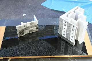
This is mine and Nathans 1:100 scale model of the corner of Aucklands old railway station and apartment buildings. We were looking at space, the history and feeling of the buildings. The smaller railway building seemed to have a large void/ space on the inside whilst the large apartment bilding consisted of lots of little rooms which felt kind of jail and maze like to us. the apartment building has a spread sheet which like represents quick, easy and uh sorta large, lifeless material and design. The railway has photographs as we felt it had a strong sense of history, livelyness and detail to it.
1:100
1:100

1:100